A new map shows the London pubs which are at the highest risk of closure
Get ‘em before they’re gone


Get exclusive shortlists, celebrity interviews and the best deals on the products you care about, straight to your inbox.
You are now subscribed
Your newsletter sign-up was successful
Pubs haven’t had an easy time of it recently, with rising costs and yo-yoing support, all of which has left a bit of a massive question mark over their future.
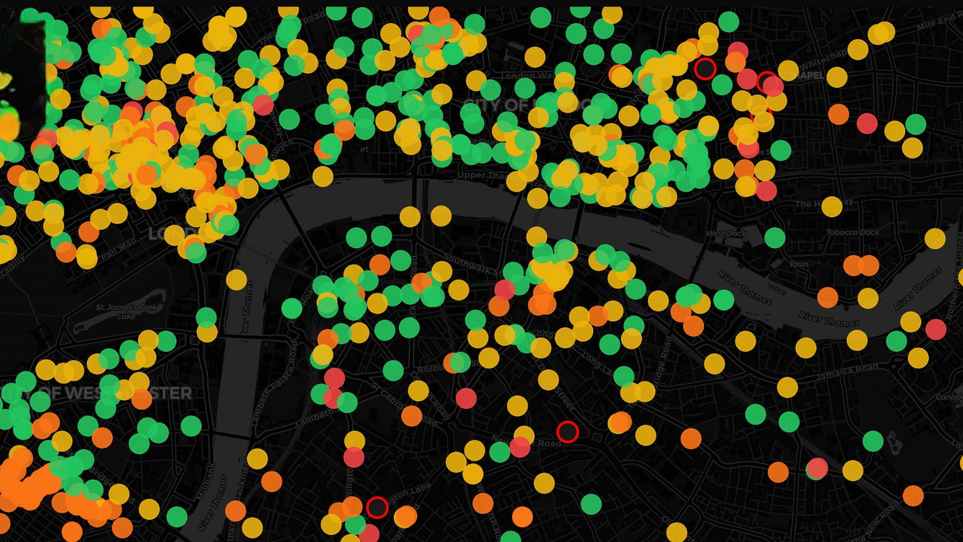
Following widespread backlash from Rachel Reeves’s initial Budget, which proposed an increase in business rates for all businesses, a 15% discount was promised for pubs earlier this week, but despite this, things are still looking uncertain. In the spirit of, erm, being prepared, Ben Guerrin created a handy and to-the-point website ismypubfucked.com – essentially a giant map showing the risk of closure for every pub in the UK.
The site also has a leaderboard highlighting the ‘most fucked’ pubs in Britain, which can be filtered by postcode so you can hone in on your local. The map rates every single pub (a whopping 45,936 spots) on a scale of ‘fine’ to ‘absolutely fucked’ – an excellent scoring system which we’d recommend big companies also implement for your 1:1 progress meetings.
For London, the pubs in the red zone at most danger of closing include Spit and Sawdust in Southwark, The Little Apple in Kennington, The Greyhound, Duke of Wellington in Spitalfields and The Wilton Arms in Knightsbridge, to name a few, all of which rank ‘absolutely fucked.’ The ranking indicates that pubs in that category could see a 200 percent increase in their ratable value – in other words, the death knell is a-ringing.

The website has been created using the official data from the Valuation Office Agency (VOA), the government body responsible for business rates in England and Wales. It then takes this data and compares the current rates with the proposed rates for 2026, calculating the risk of closure for each spot when the rates change in April this year. In its own words, the ‘fucked pub index’ the site has been created by “our world-class data scientists (one guy with a spreadsheet) have developed the Fucked Pub Index — a groundbreaking metric that combines advanced geospatial analysis (Google Maps) with sophisticated fiscal impact modelling (basic maths) to identify the pub near you that most urgently requires your patronage.”
79% of pubs are facing increases, rendering 11% of the UK pubs ‘fucked or worse’, according to the site.
The site also helps you plan your own pub crawl, by whacking in your postcode and tapping on each pub plotted on the map to generate your next Friday night plans. All in the name of supporting the economy and local businesses, of course.
Get exclusive shortlists, celebrity interviews and the best deals on the products you care about, straight to your inbox.

Skip the search — follow Shortlist on Google News to get our best lists, news, features and reviews at the top of your feeds!

Hermione Blandford is the Content Editor for Shortlist’s social media which means you can usually find her scrolling through Instagram and calling it work, or stopping random people in the street and accosting them with a mini mic. She has previously worked in food and drink PR for brands including Johnnie Walker, Tanqueray, Gordon's, The Singleton, Lagavulin and Don Julio which means she is a self confessed expert in spicy margaritas and pints, regularly popping into the pub in the name of research.
You must confirm your public display name before commenting
Please logout and then login again, you will then be prompted to enter your display name.