The 50 worst football kits ever
A fashion-free zone

It must be difficult trying to come up with a new football kit design. You're fairly constrained by the team's colours and most of the good ones have been done before. But clearly the pressure of having to produce a new one every season, and the recent requirement for third and fourth kits, have just led to designers occasionally going a little bit insane. It's the only possible explanation for this eye-watering gallery of style abominations.
- Okay these football kits are the worst but these are the best football boots around right now
We present 50 of the worst football kits of all time. Prepare to enter a fashion-free zone.
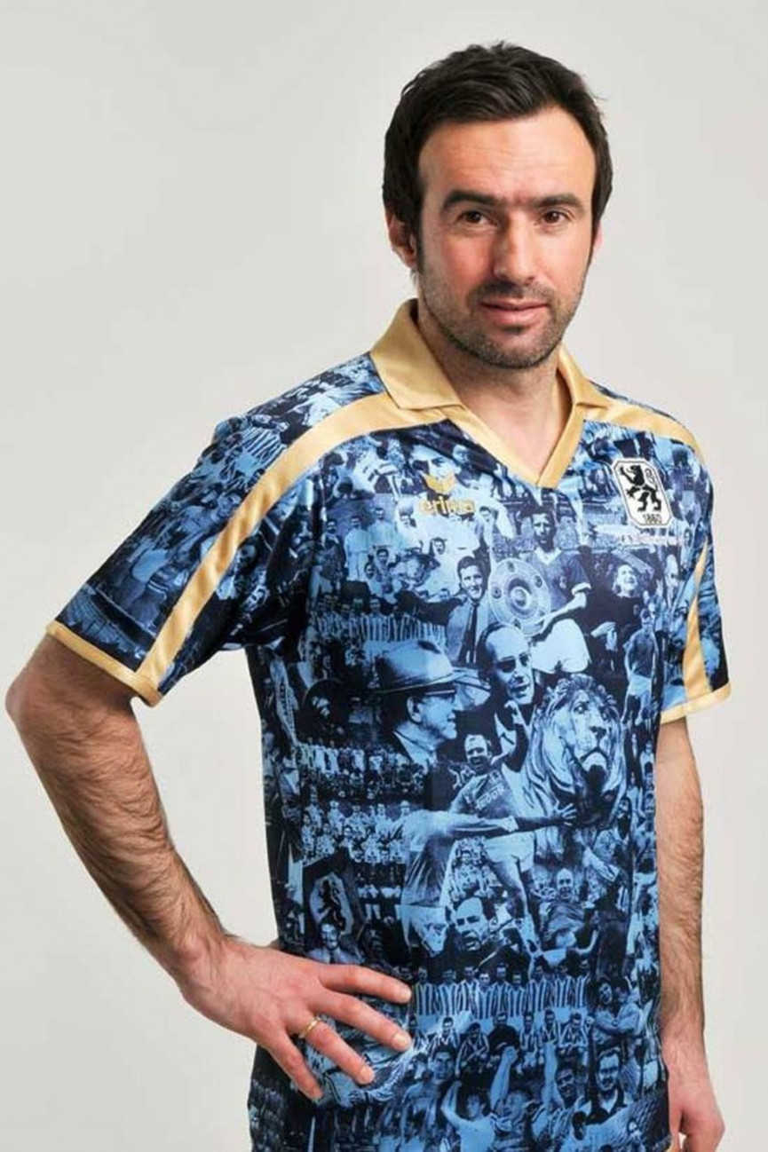
1860 Munich
Year: 2010
Don't let that man's suave appearance fool you. This is a hideous football kit. Created to 'celebrate' the club's 150th anniversary, the shirt is apparently filled with glorious scenes from the club's past. But it's a total mess, complete with 70s-style yellow lining. Nein.
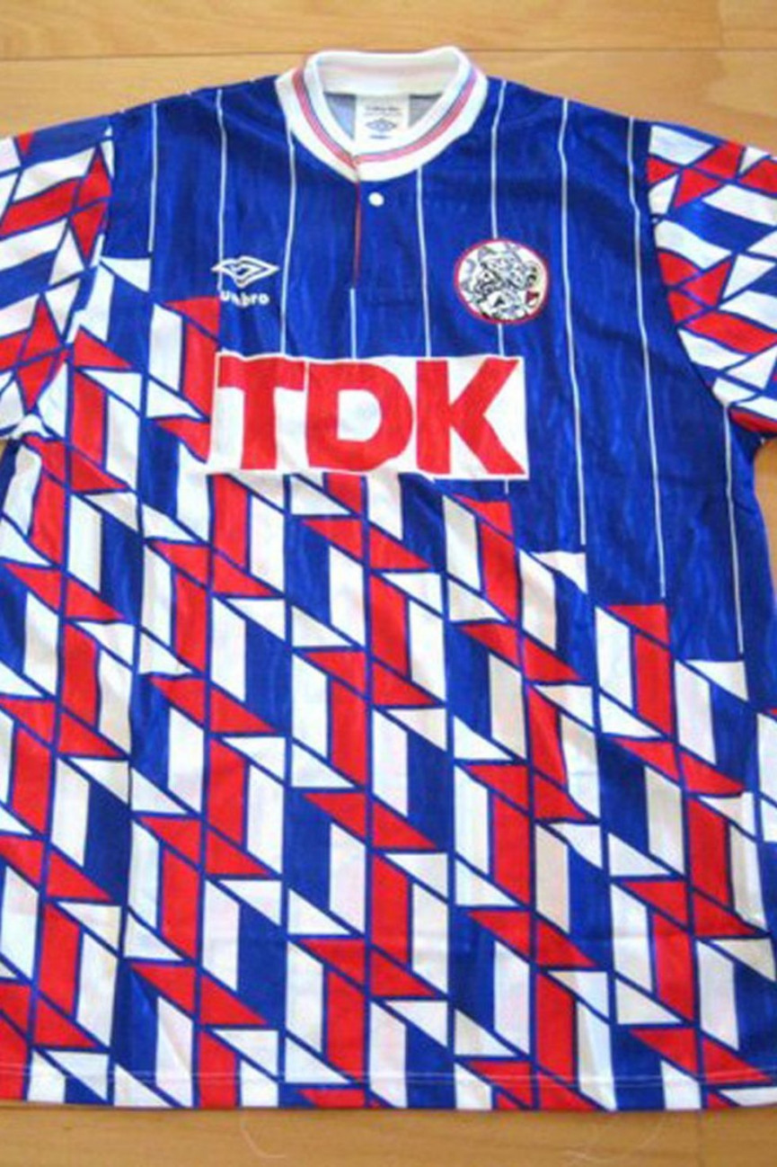
Ajax
Year: Unknown
This looks like they really wanted to go for the triangles, but didn't quite have the guts to do them across the whole shirt, so it just looks strange. If it's any consolation, the triangles across the whole shirt would have been virtually as bad.
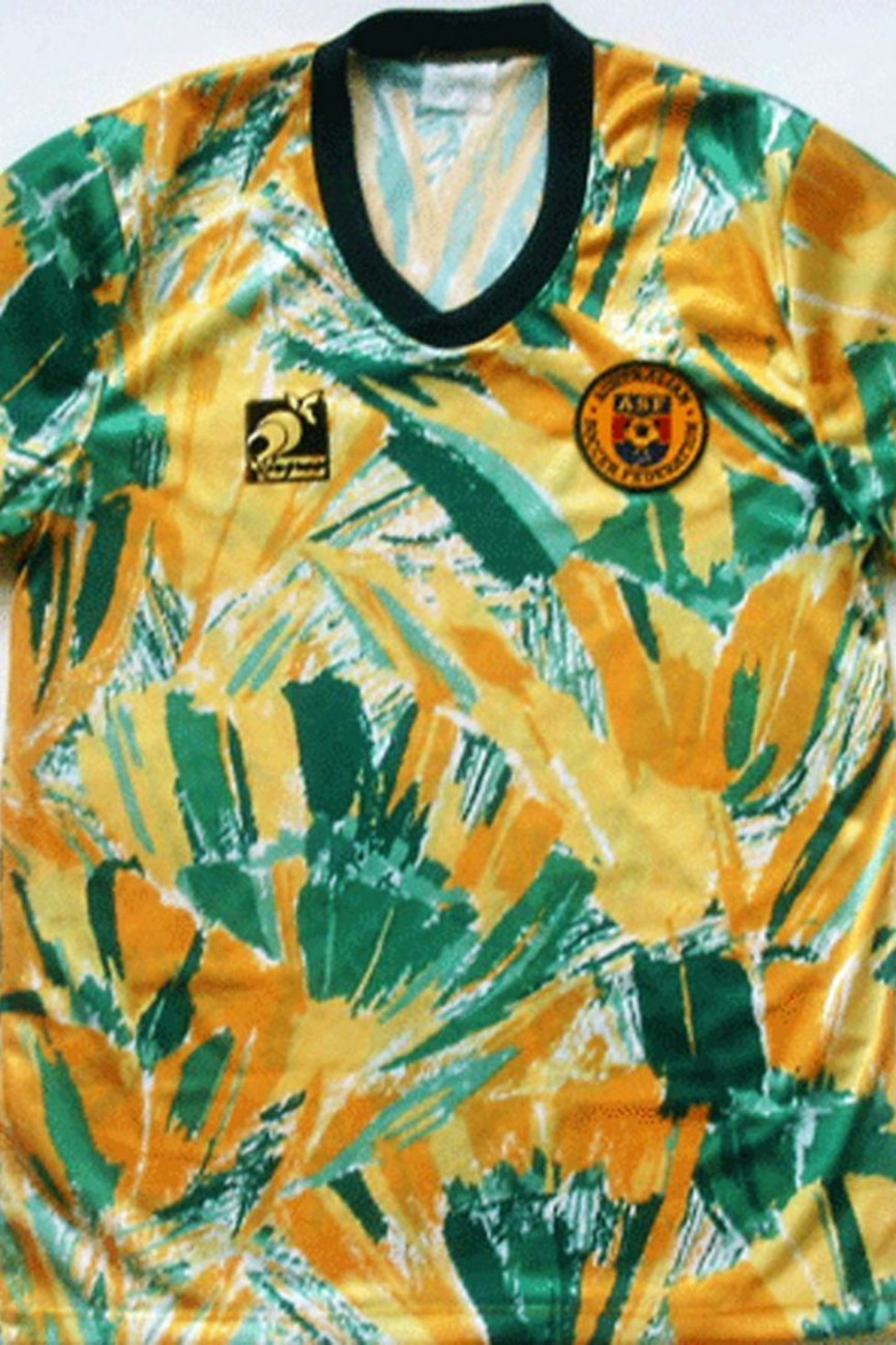
Australia
Year: 1990
Get exclusive shortlists, celebrity interviews and the best deals on the products you care about, straight to your inbox.
This looks like one of Nelson Mandela's shirts. And, while Nelson could pull off this look, no-one else can. You are not, and never will be, as cool as Nelson Mandela and don't you forget it.
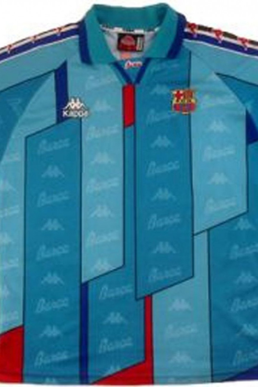
Barcelona
Year: 1995
Barcelona may now be a byword for class and style, but it wasn't always the case. This design has no logic to it whatsoever. And the colours just look strange. It's like an unwell fish or something. And what are the flaps all about?
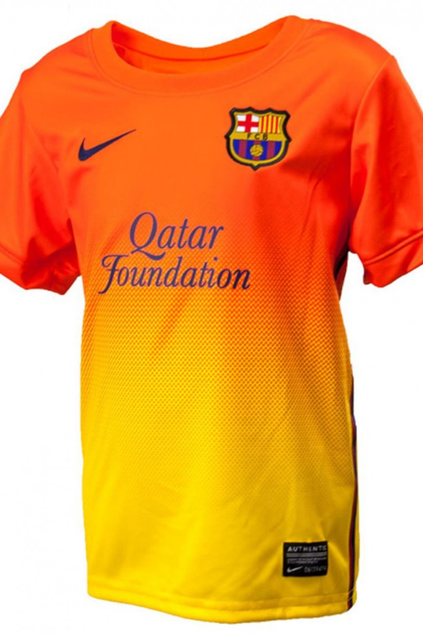
Barcelona
Year: 2013
We say that Barcelona is now a byword for style and class, yet they're still capable of this monstrosity. Buy now if you want to look a little bit like you're on fire.
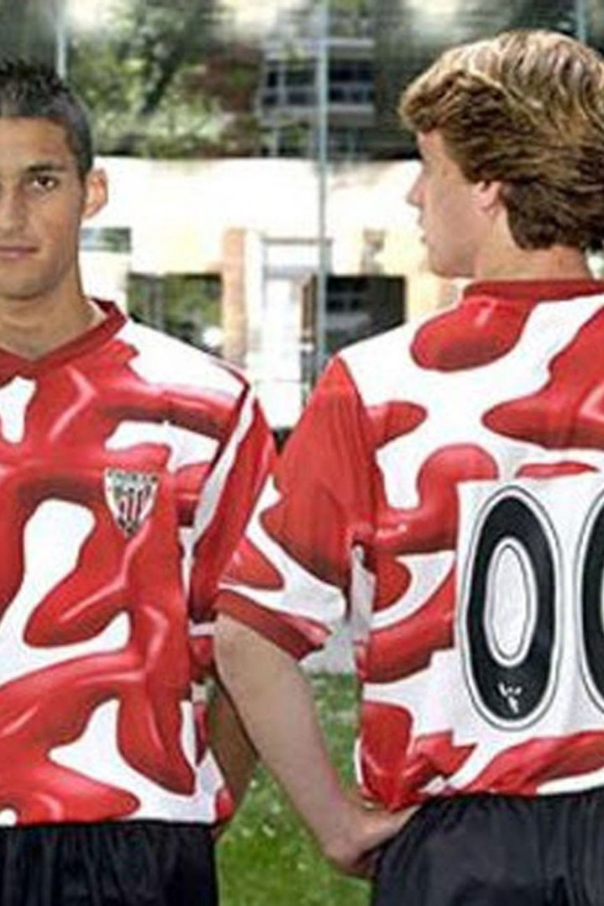
Athletic Bilbao
Year: 2004
Just because Salvador Dalí was Spanish, doesn't mean he should influence their football shirts. Top marks for attempting to incorporate some surrealism into your kit, but it basically looks like you've spilt tomato ketchup over yourselves there lads.
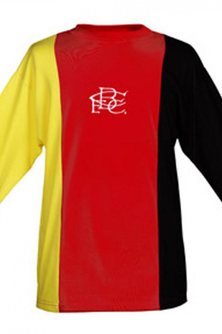
Birmingham City
Year: 1972
We're still not sure what Birmingham were thinking. For their 3rd kit in the 72/73 and 73/74 seasons, they wore a jersey which can only be described as a German flag. Were there lots of German players in their team at the time and they wanted to make them feel at home? No, there weren't. Just bizarre.
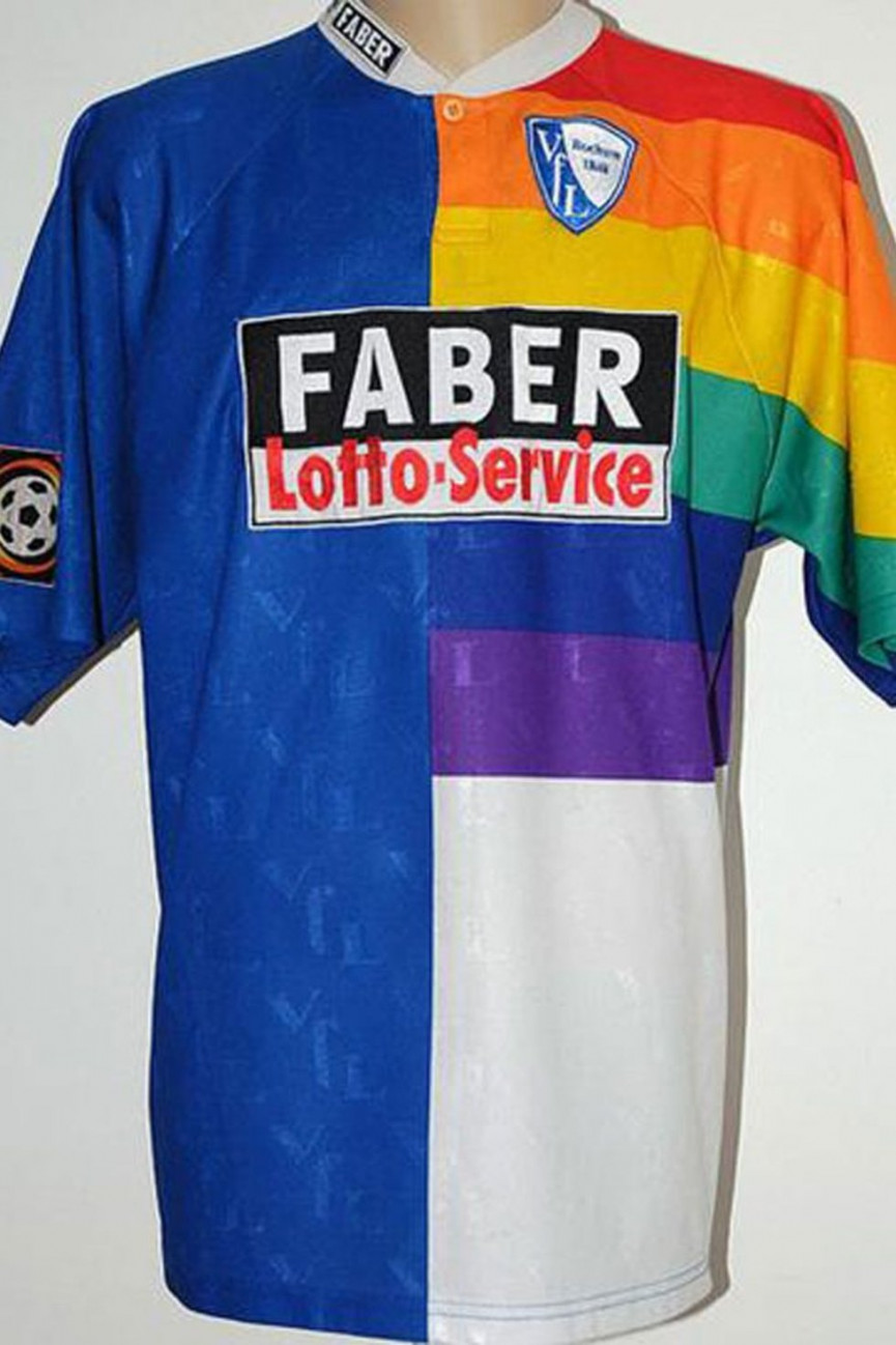
Bochum
Year: 1997
A kit clearly designed by two people, both given one half, and instructed never to meet. This does not make sense on any level.
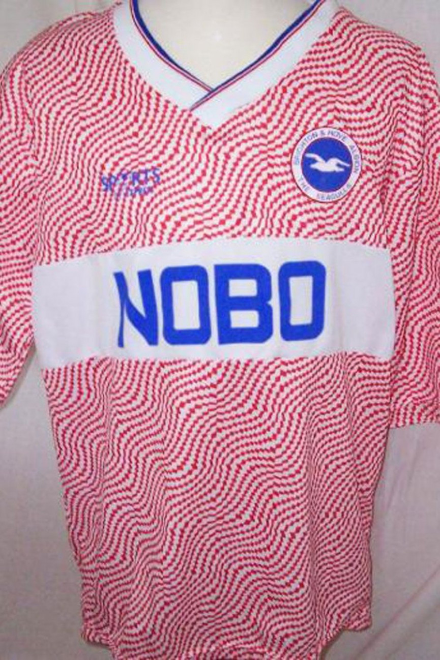
Brighton & Hove Albion
Year: 1986
"The clowns upstairs have signed a deal for us to be sponsored by a company called NOBO. We may as well go for wavy pink lines, we're gonna endure constant abuse anyway aren't we?"
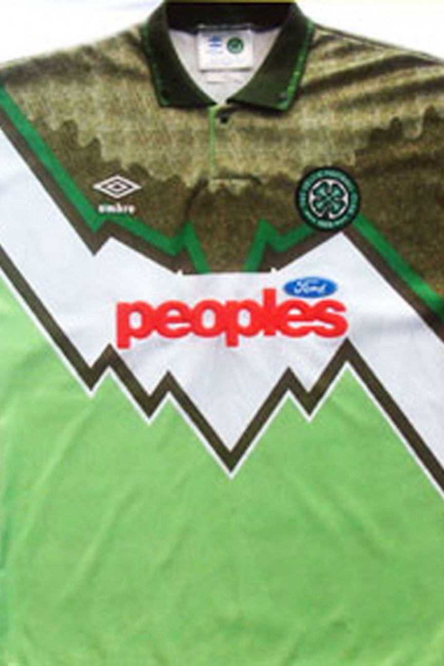
Celtic
Year: 1991
Just where do you start? is the zig-zag line a performance indicator for the coming season? Why is that such a horrible shade of lime green? Why does the top right-hand quadrant look like someone's accidentally split brown paint over it? Dreadful.
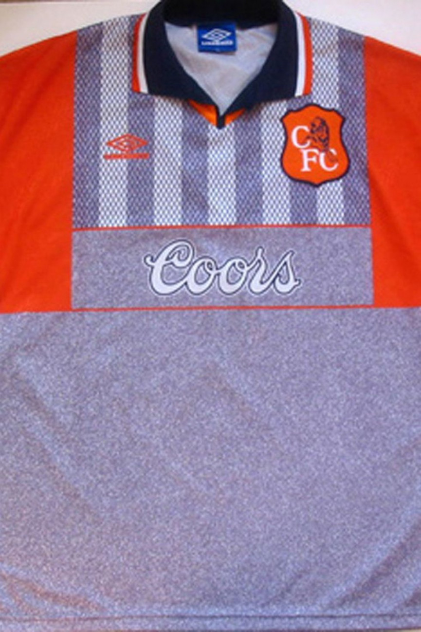
Chelsea
'Year: 1994
For a start, orange and grey don't really work together and, secondly, the top half just seems to be a strange assortment of different sized oblongs. Utterly nonsensical.
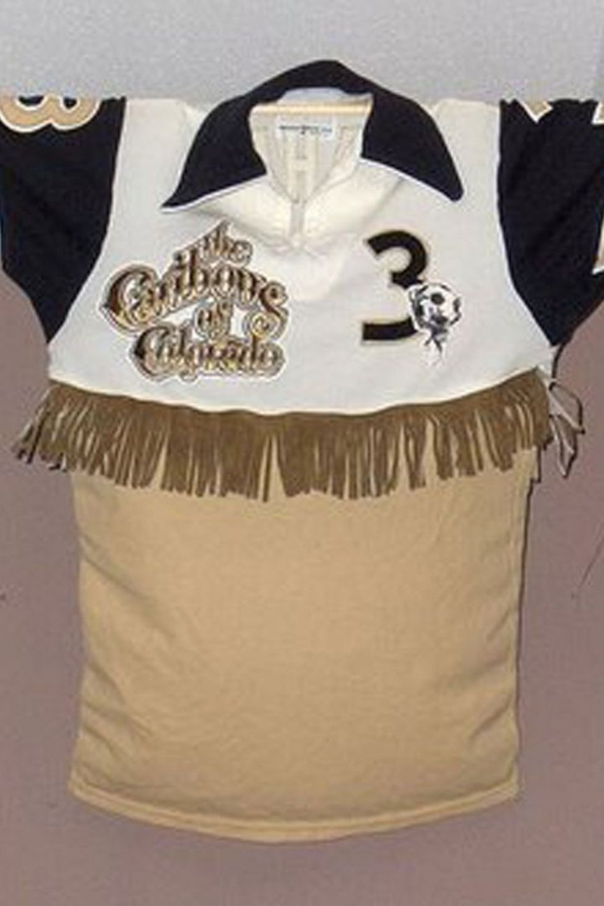
Colorado Caribous
Year: 1978
You have to give them credit for trying, but this must surely be filed under "cowboy tassles and football shirts should never mix".
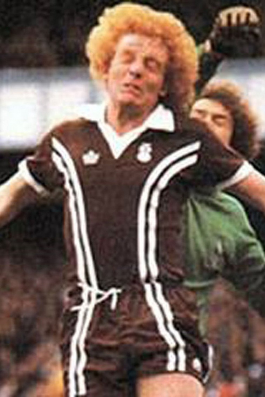
Coventry City
Year: 1978
Regularly voted the worst strip of all time and for good reason: whoever thought that a brown strip was a good idea? The one bonus was that you wouldn't look any different after a mudbath January match.
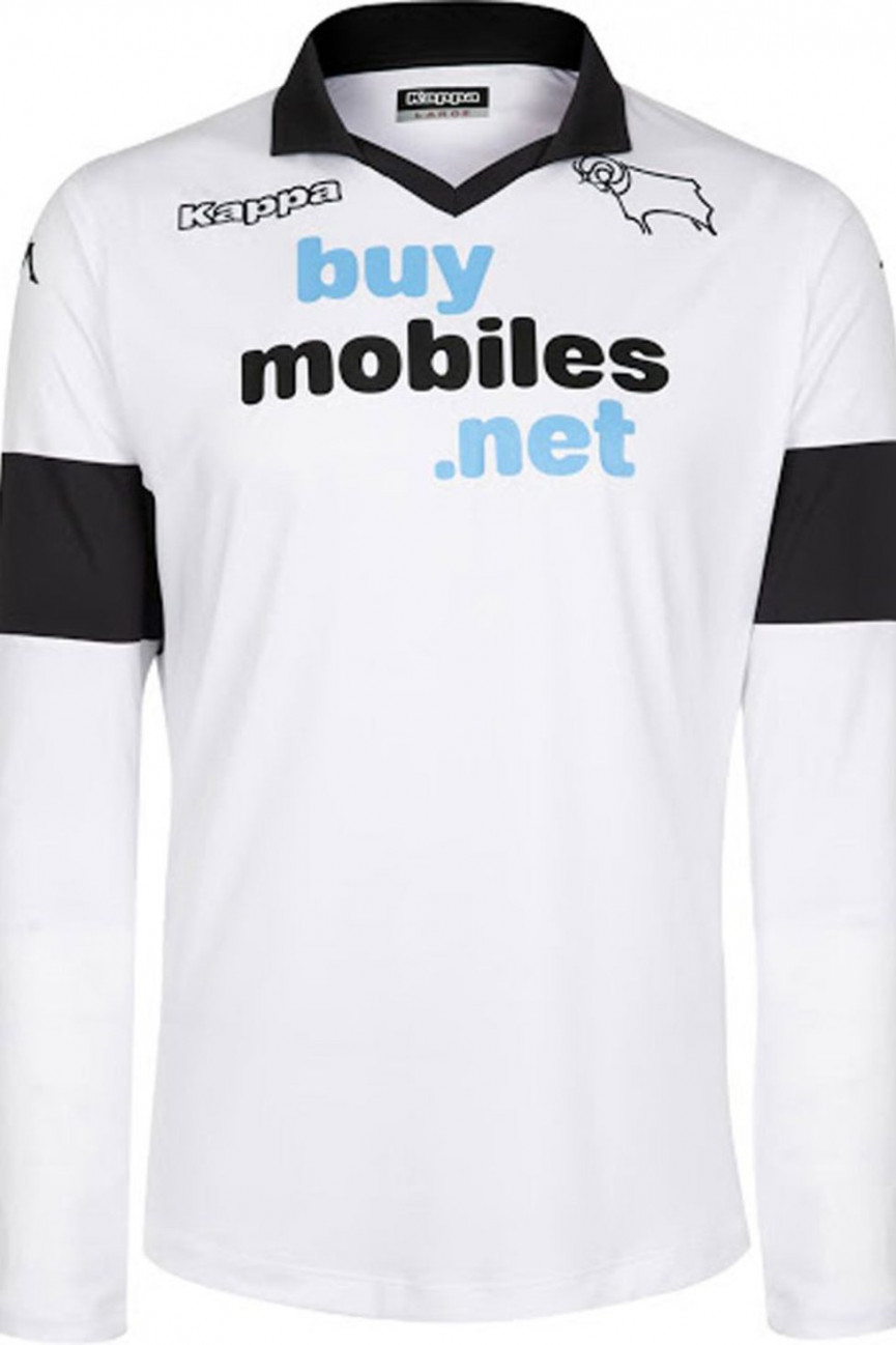
Derby County
Year: 2013
It's got a terrible sponsor, the fonts must have been chosen by a 4-year-old and it looks like it took 2 minutes to design. Most baffling, though, are the arms, which have been adorned by permanent black armbands: poor County must have looked like they were commemorating someone's death every time they stepped on the pitch.
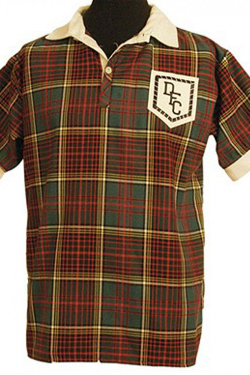
Dundee
Year: 1953
Tartan should only be seen in the crowd - and only then in the form of kilts and 'comedy' tartan caps with ginger hair in the Tartan Army. It should never, repeat, never be used on a football shirt. Glad we've made that clear.
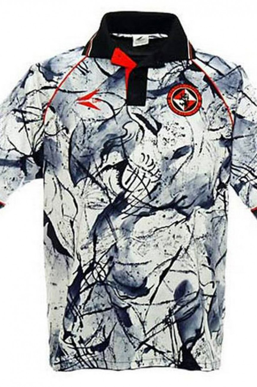
Dundee United
Year: 1993
For some inexplicable reason, Dundee United decided to go 'Jackson Pollock' on us in 1993. If we found out this was created by a toddler flicking black paint at a canvas we would genuinely not be surprised. Woeful.
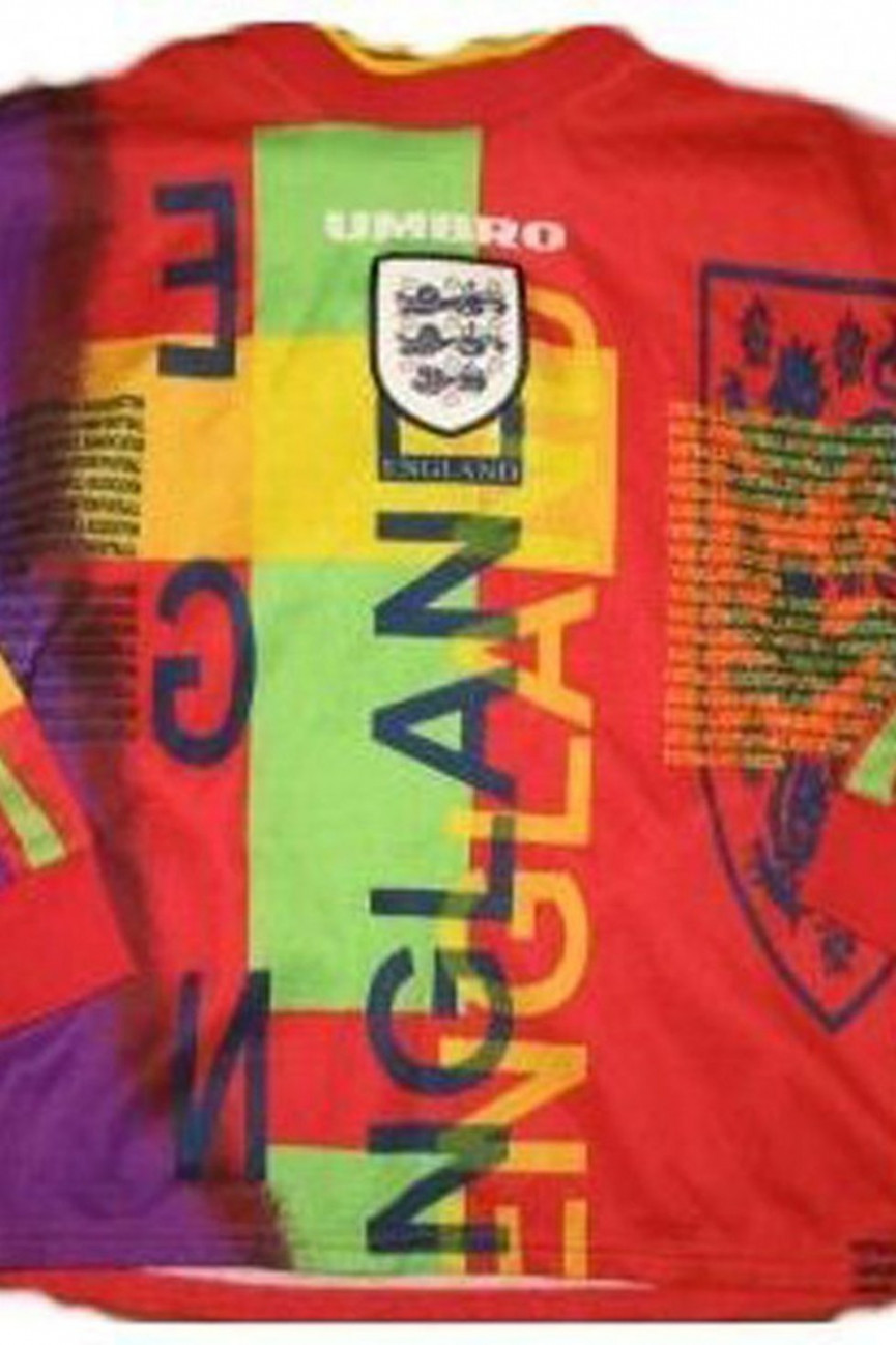
England
Year: 1996
A king amongst terrible football shirts, this was universally derided upon its launch for England's home Euro '96 campaign. Just thank your lucky stars that this was before David Seaman's ponytail era, otherwise the combined image would have simply been too much to take.
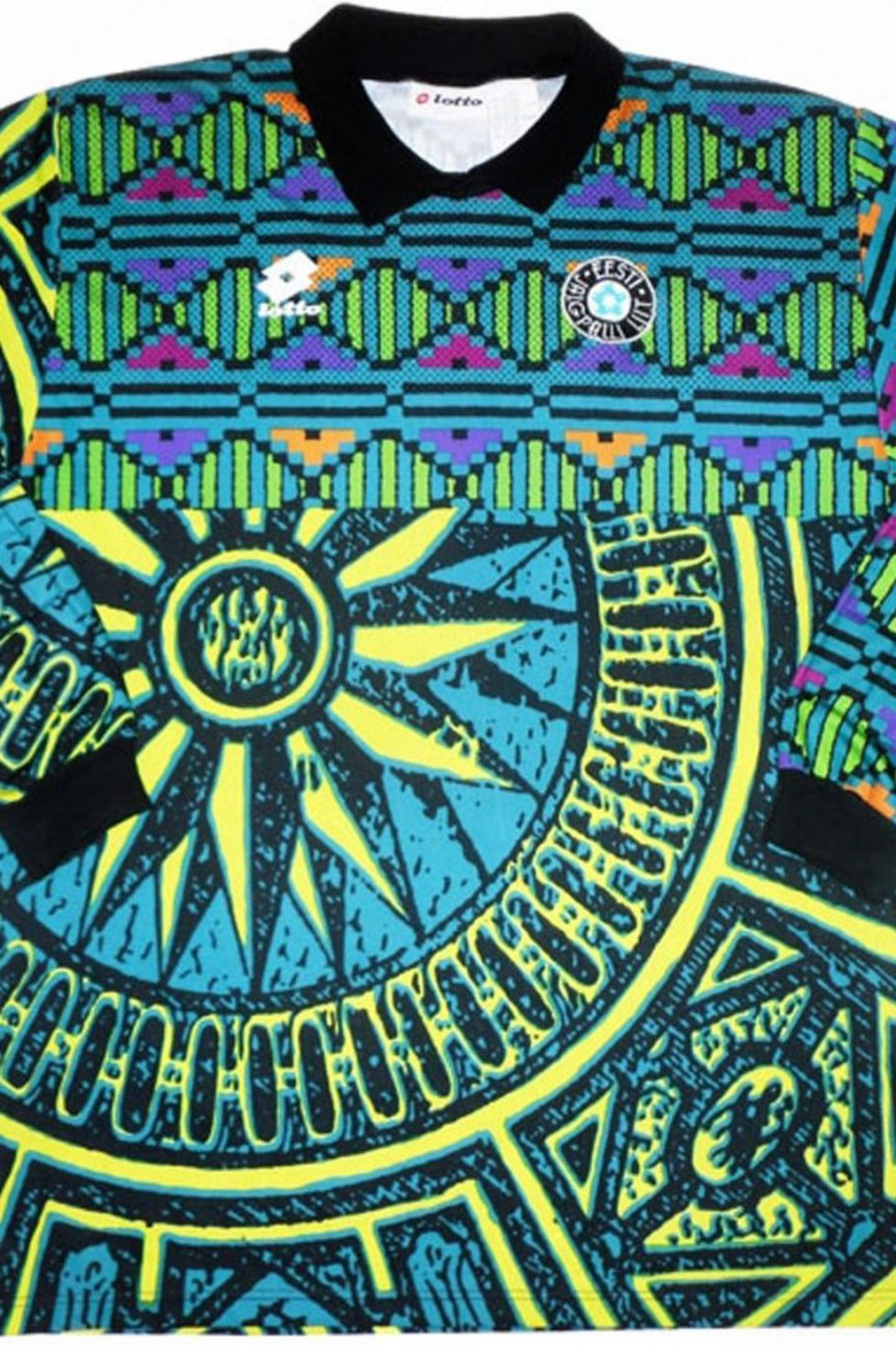
Estonia
Year: 1996
What is going on here. Top half: some kind of 8-bit rhombus pattern; bottom half: a painting of a sundial. We have absolutely no idea.
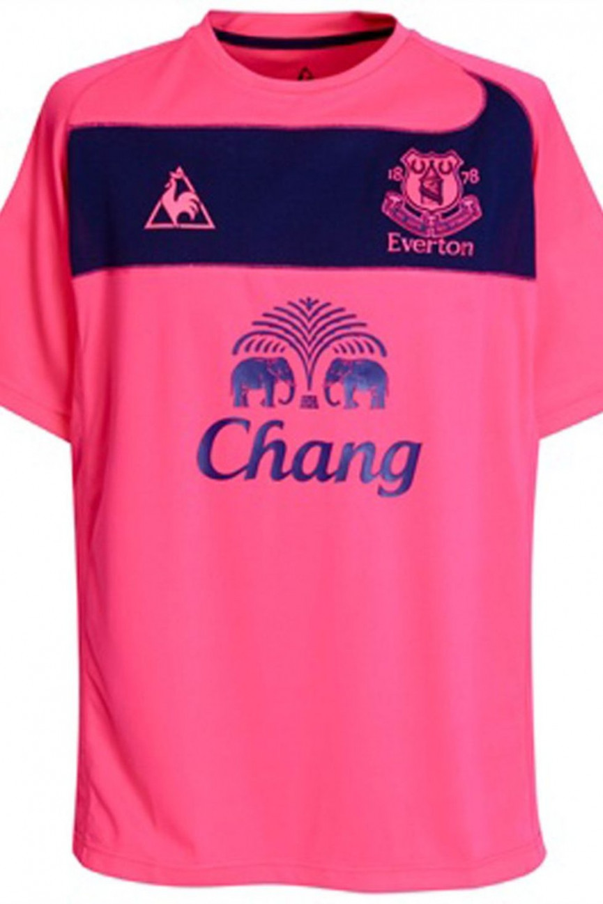
Everton
Year: 2013
There's nothing wrong with pink in the right context. But not pink quite as shocking as this. They certainly won't miss each other on the pitch, that's for sure. But what's the big blue oblong about? And why is there a little tidal wave happening at one end?
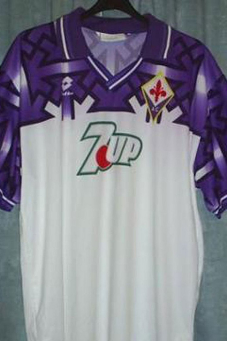
Fiorentina
Year: 1992
At first glance, you may think, "what's wrong this this then?" And then you'd look a little closer, and perhaps gaze awhile at the purple section, and then maybe there'd be a dawning realisation that a rather 'controversial' political symbol has made its way into the design. At least, this is what would happen to normal people, but clearly not the designer of Fiorentina's kit in 1992. It had to be hastily withdrawn from sale after the error was spotted.
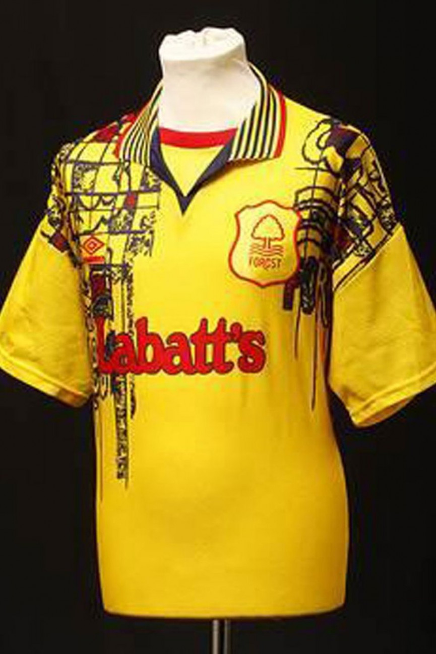
Nottingham Forest
Year: 1997
A perfectly nice yellow shirt that someone has decided to scrawl over with marker pen. What a shame. Oh, that's the real kit? Is it...is it really.
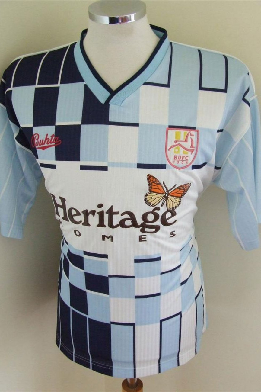
Hartlepool United
Year: 1991
This is like a chess board gone wrong. Nice butterfly though.
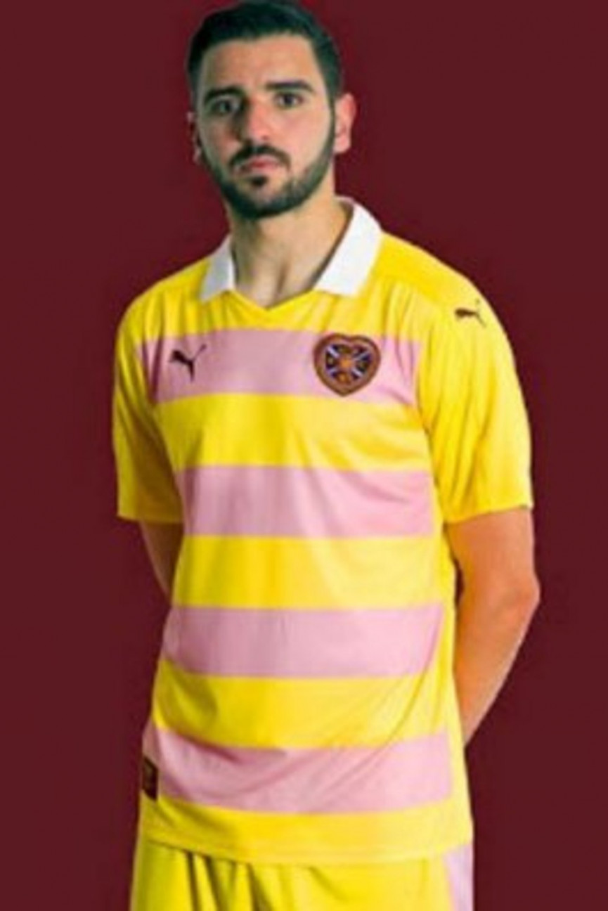
Hearts
Year: 2016
Fruit salads: an undeniably excellent sweet, although they do have a tendency to get stuck in your teeth. A kit that looks like a fruit salad: an undeniably terrible idea, which unfortunately has a tendency to get stuck in your brain.
Please, remove our eyes, for we have no use for them any more.
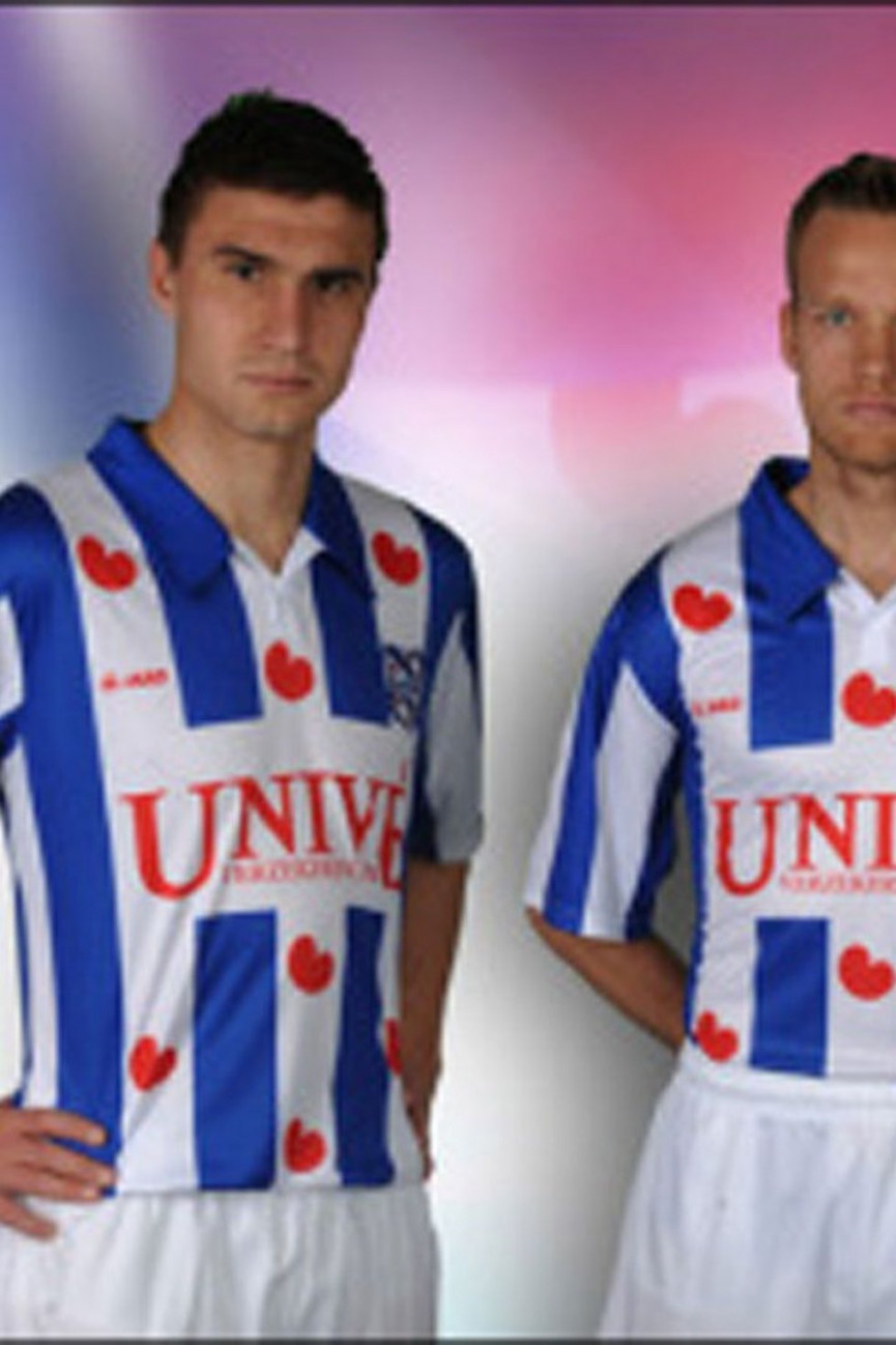
SC Heerenveen
Year: Various
Fair play to Heerenveen: the little red hearts are in their club crest, and have been on their shirts for a long time. It doesn't stop them looking absolutely ridiculous though. What's truly awful though is that they didn't include them on the arms, thus making it impossible to make a "they wear their heart on their sleeve" joke. And that's unforgivable.
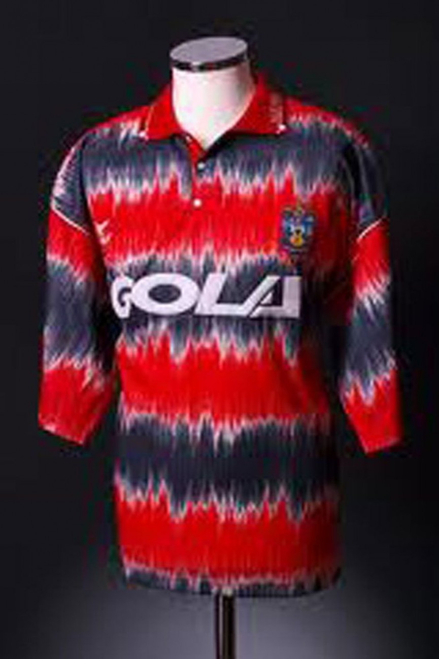
Huddersfield Town
Year: 1991
It's a bit tie-dye-tastic isn't it?
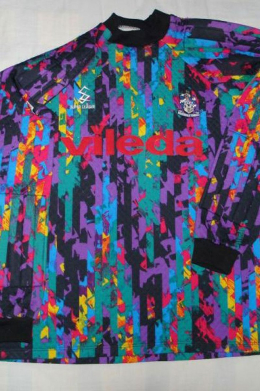
Huddersfield Town
Year: 1993
Pity those poor Huddersfield fans. After 1991's monstrosity, less than two years later they were faced with this in the club shop. It looks like a mop shortly after cleaning up an explosion at a paint factory.
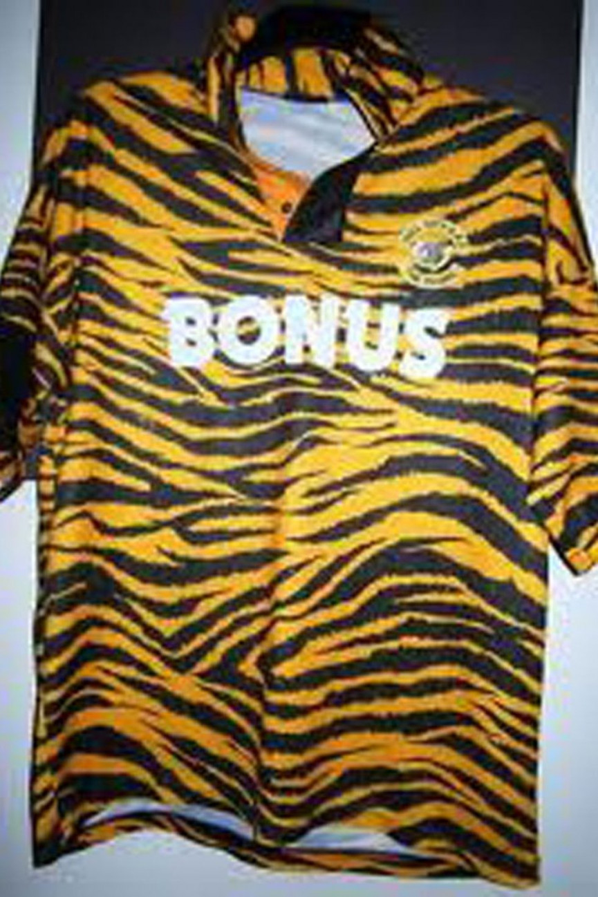
Hull City
Year: 1992
We thought long and hard about this one. They are the Tigers after all. Is it actually quite cool? No. It is not. It looks like it's been made from the offcuts from Del Boy's duvet.
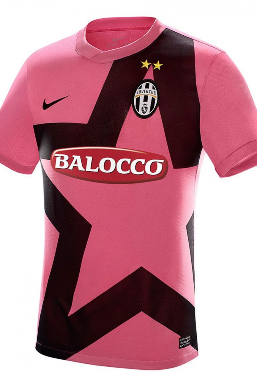
Juventus
Year: 2011
As discussed before, nothing wrong with pink. But also as discussed before, there is something wrong with pink this bright. And why have they put a star-shaped biscuit cutter on there? Also loses marks for appearing to be figure-hugging: alright for highly-toned footballers, not so flattering on the beer-bellied supporters in the terraces.
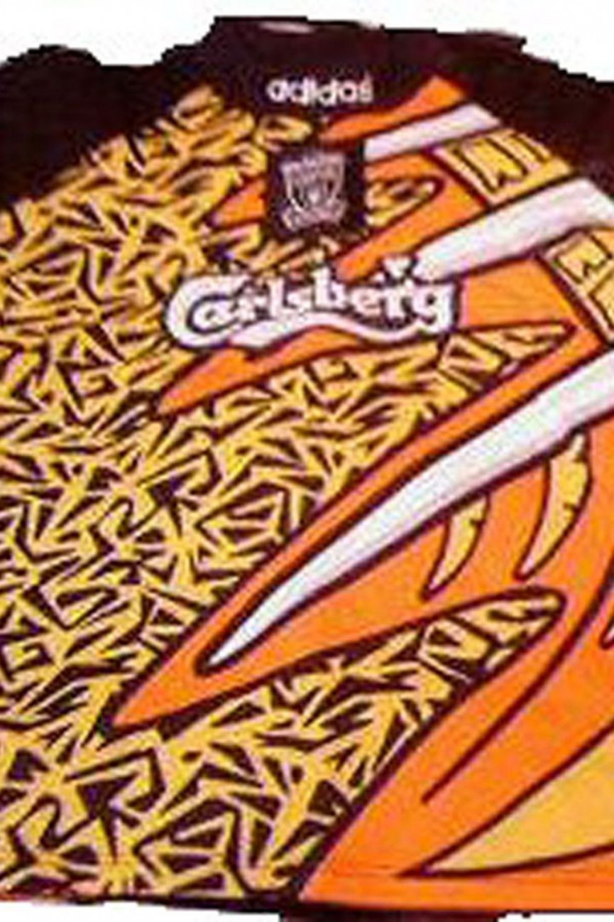
Liverpool
Year: 1995
We think we've worked this out. Someone did a rough design using their new felt -tip pens and it got sent to the factory instead of the proper one where they'd designed it properly. That must be it. It must be.
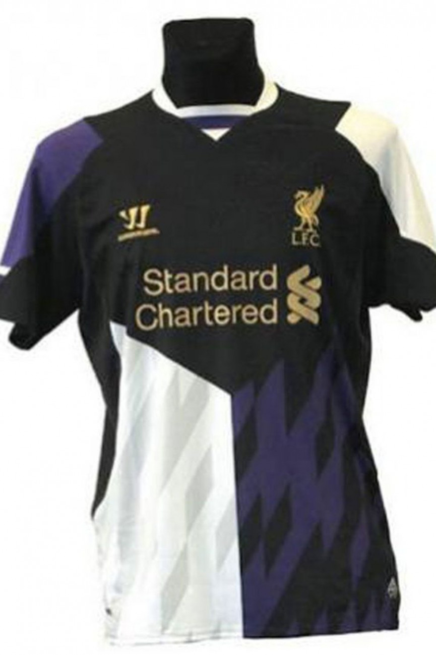
Liverpool
Year: 2013
The most recent addition to our hall of fame, this really is a novel way of designing a kit. Three segments, all completely unrelated, purple, black and white bits...some sort of random rhombus shadows...we're really struggling here. This has to have been designed in the dark, it's the only logical explanantion.
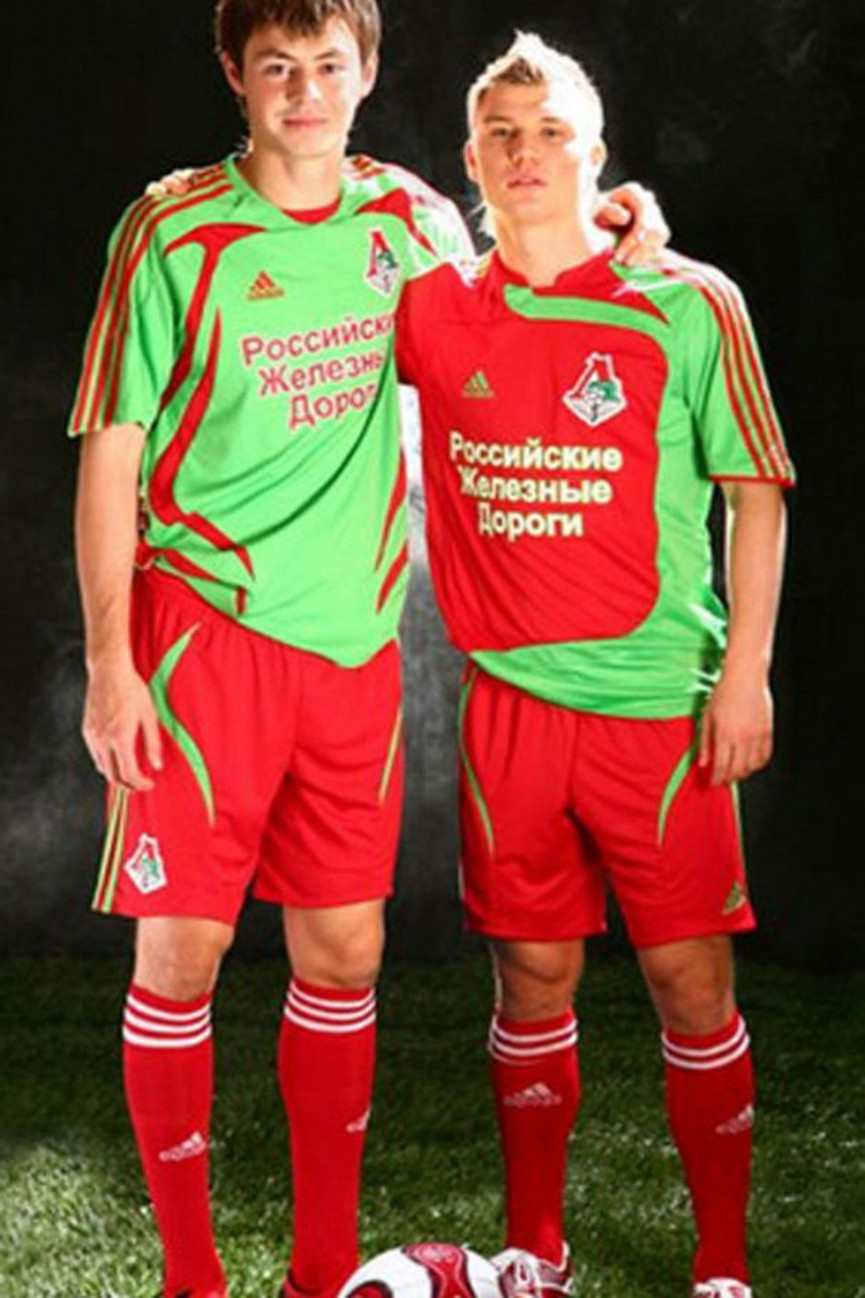
Lokomotiv Moscow
Year: 2007
Our eyes! Our eyes! Season ticket holders at Lokomotiv must have gone blind by 2008 with this luminous creation. Just horrible.
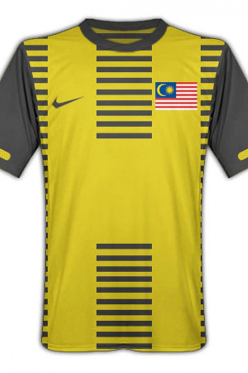
Malaysia
Year: 2011
This shirt makes it look like you've just been run over.
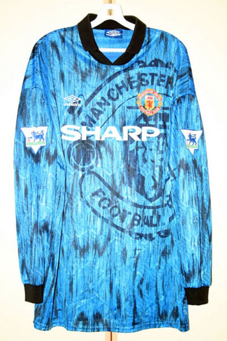
Manchester United
Year: 1992
This shirt (particular when worn by Lee Sharpe) couldn't be more 90s if it tried. A faux-trendy, tie-dye mess. Like Dani Behr, we'd rather just forget all about this.
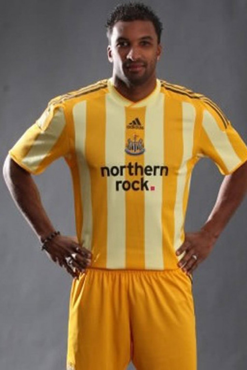
Newcastle United
Year: 2009
Poor Newcastle United fans. As if being run in a way that could charitably be called 'interesting' and perennially underachieving wasn't enough, they were lumbered with this 2-tone banana yellow jersey for their season in the Championship in 09/10. It's so bad it's actually quite funny.
Norway
Year: 1996
Someone in Norway just learnt how to use WordArt didn't they?
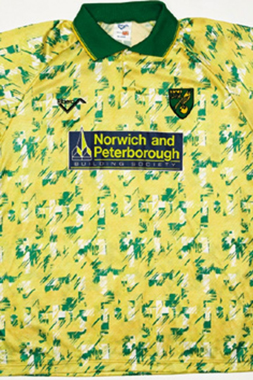
Norwich City
Year: 1992
Much like the Hull City tiger strip, this has been the subject of intense debate. Is it actually brilliant? It's almost artistic - and it brings back memories of Jeremy Goss and Chris Sutton at their imperious best. Unfortunately, once someone informs you that it really does look quite a lot like vomit, you can never really get that thought out of your head.
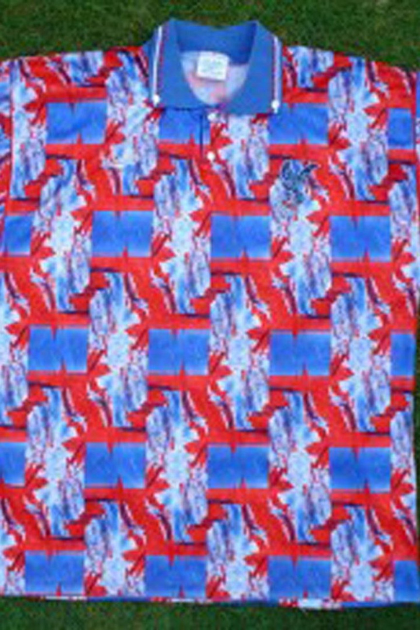
Crystal Palace
Year: Unknown
This looks like a colourblindness test. It just makes our eyes hurt.
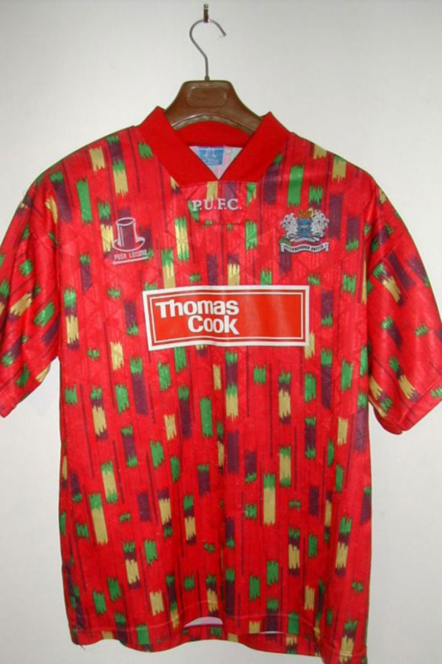
Peterborough United
Year: 1993
What on earth is this. It's that classic combination of toddler and poster paints again isn't it?
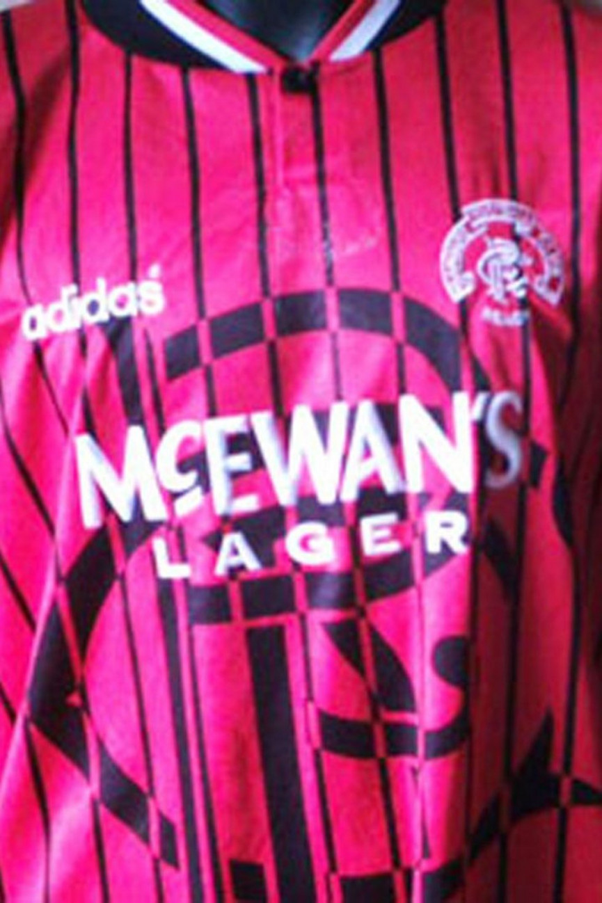
Rangers
Year: Unknown
Wear this if you want to look a little bit like you're in jail. Which was oddly prescient given Rangers' financial problems a few years later.
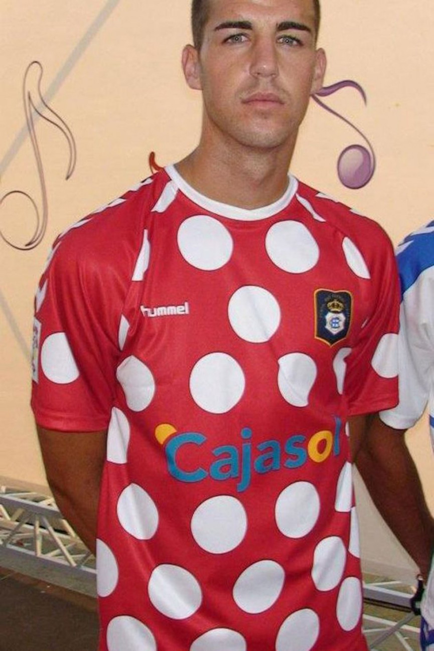
Recreativo
Year: Unknown
If we have learnt nothing else from Timmy Mallet, it's that polka dots should only ever be seen on itsy-bitsy teeny-weeny bikinis. Never, under any circumstances, on the field of play.
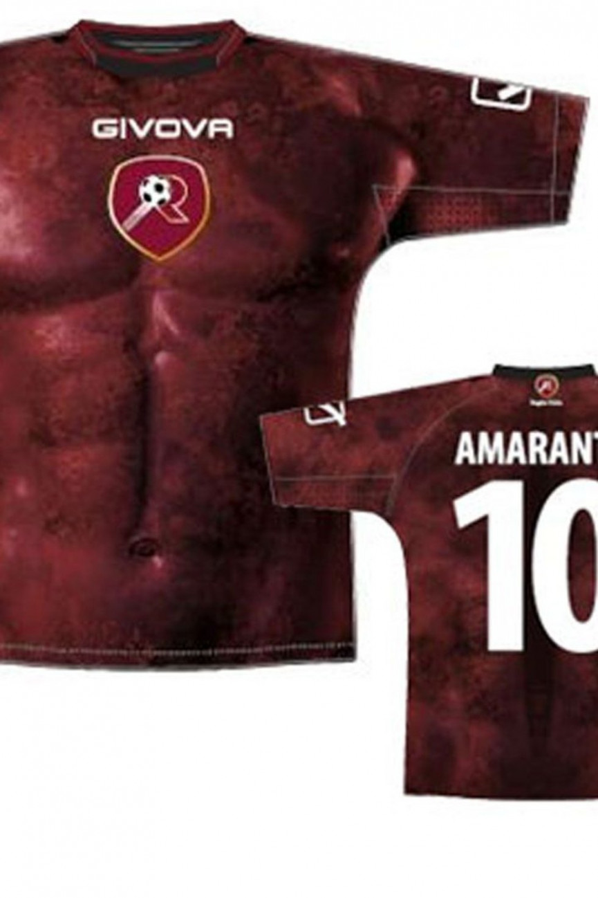
Reggina
Year: 2012
Much like the 2000 Italy shirt, this works perfectly well if you're a tall, dark, bronzed mediterranean adonis. Rather less well if you're sporting more of a barrel than a six-pack. What a terrible, terrible idea.
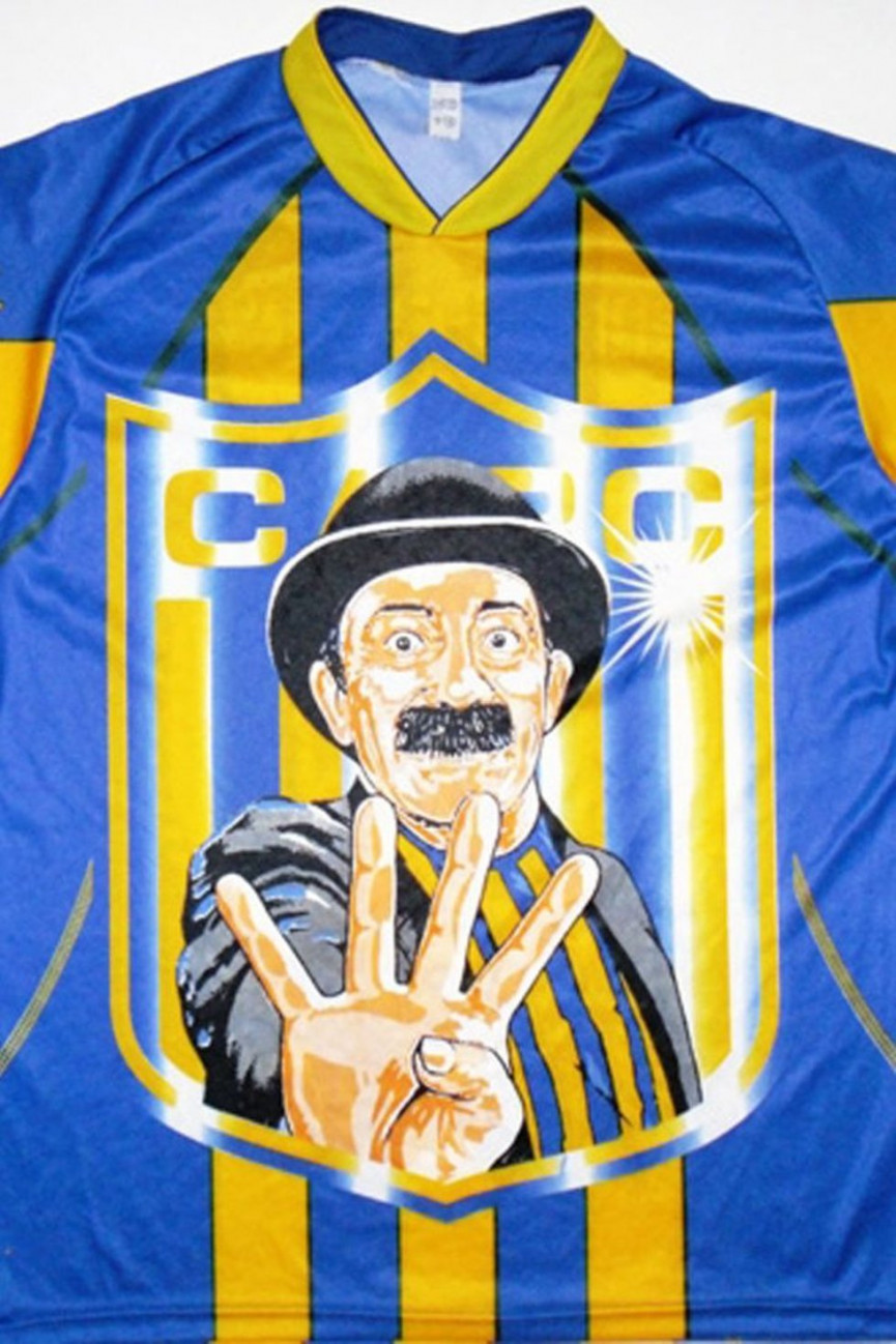
Rosario
Year: Unknown
We just don't know what's going on here. There's probably an explanation for why a bowler-hatted, moustached man is on the front of this kit, but even if there is, it really doesn't justify it. Maybe he's scoring it out of 10? Take about 4 points away and you'd be on the money.
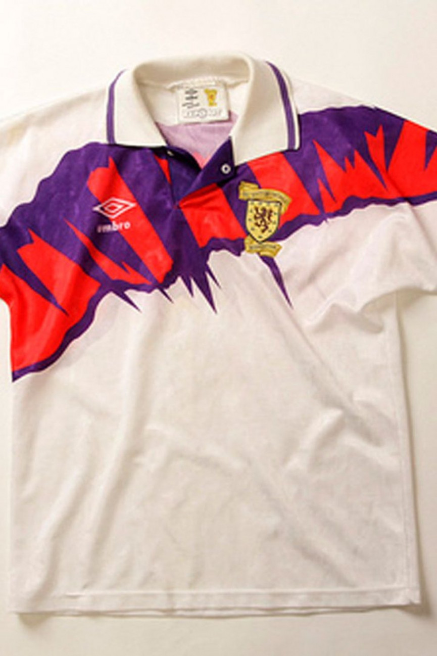
Scotland
Year: 1991
Another classic example of the 'paintbrush across the chest' football shirt design technique. It looks awful.
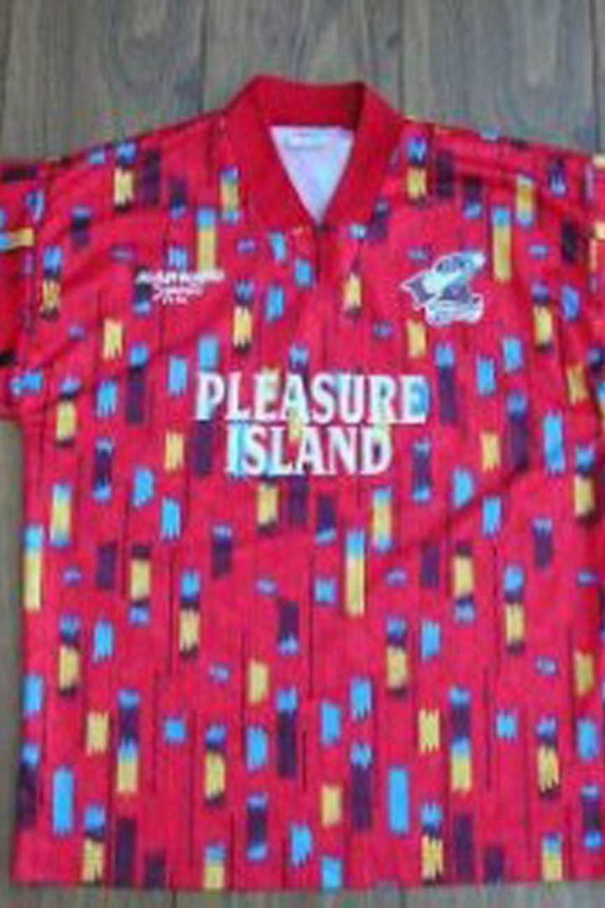
Scunthorpe United
Year: 1994
Scunthorpe United clearly saw Peterborough's effort the year before and thought "we love that, let's do something similar".
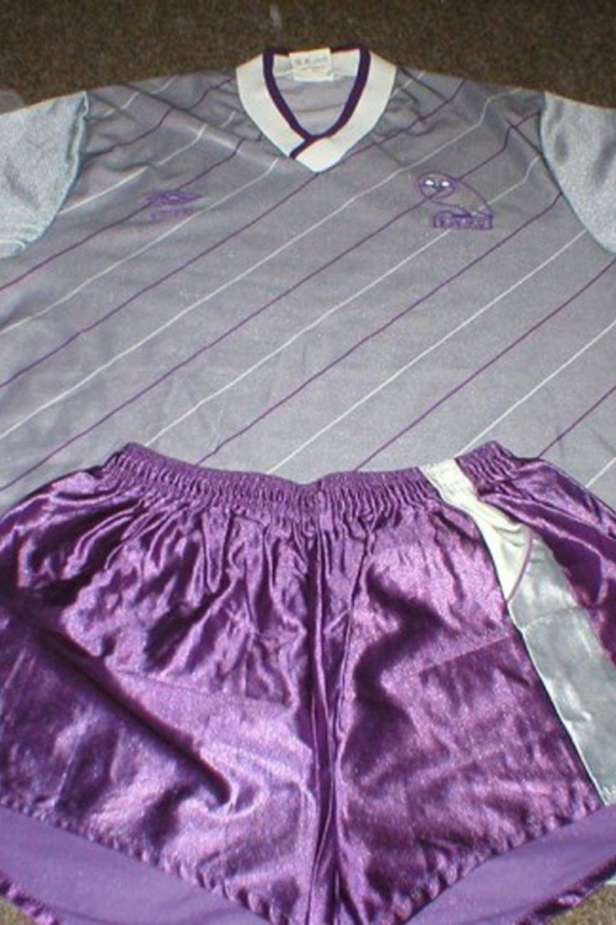
Sheffield Wednesday
Year: 1984
Looking like something out of a New York club at the height of disco fever, it's the combination of grey shirt with 45-degree angle purple pinstripe, and the shiny purple shorts that really seals this horrendous kit's place in our list. We'd love to see anyone try and wear this on a Saturday night out in Sheffield and escape intact.
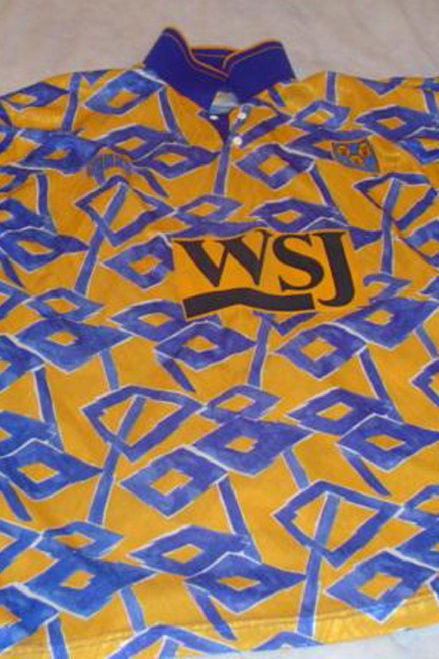
Shrewsbury Town
Year: 1992
A bizarre collection of differing sized rhombi and non-straight lines on a bed of dark yellow. Dreadful.
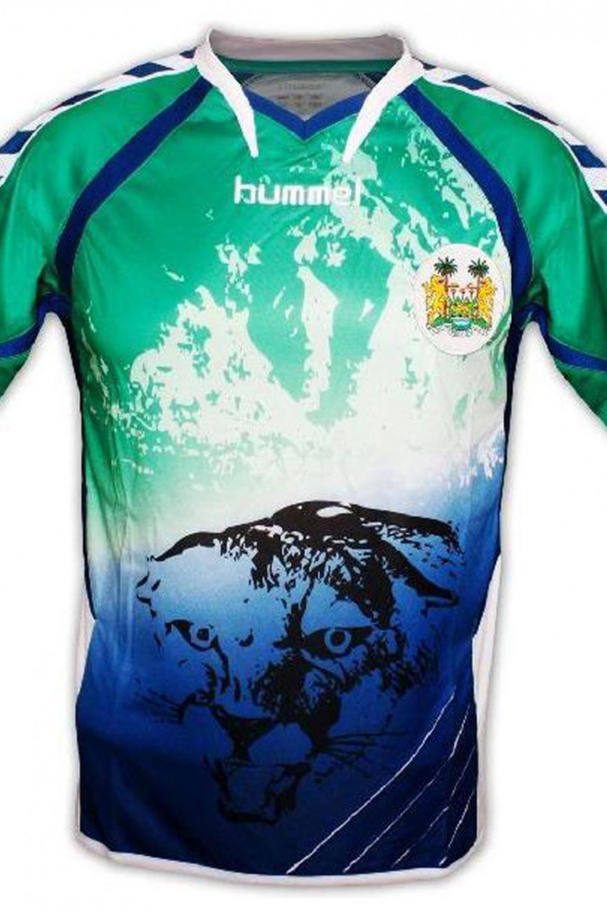
Sierra Leone
Year: 2011
The tiger is a nice idea lads, but it just doesn't work. Green fading to blue does not work either. And why add in early 90s chevrons on the sleeves? It looks a bit like a bad acid trip.
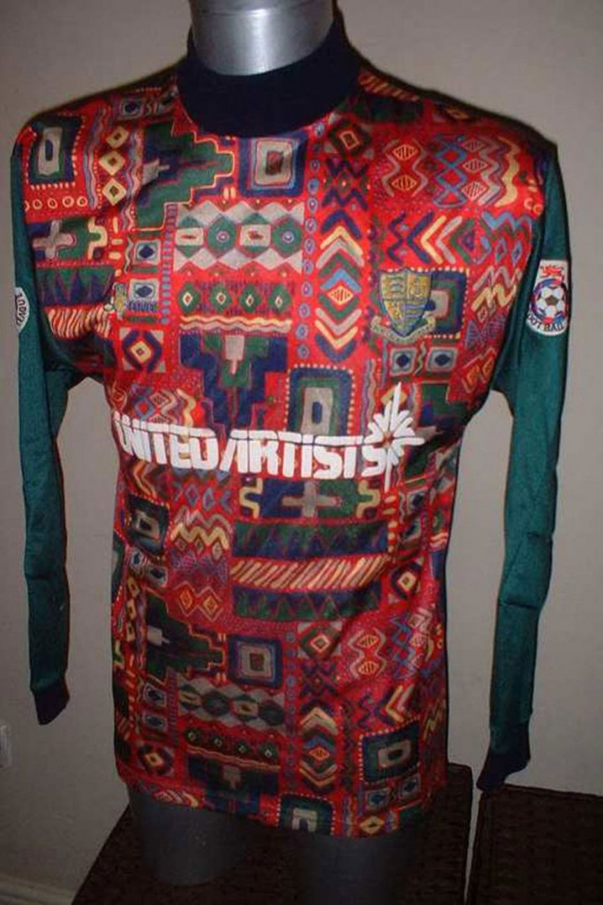
Southend United
Year: Unknown
Possibly the crowning glory of all terrible football kits; this must surely have been designed by the manager's grandma, who decided that it the 'patchwork of differing pieces of quilt' look had been cruelly overlooked by football kit designers for too long. It manages the impressive feat of looking like both a bad teatowel and an Aztec ceremonial outfit.
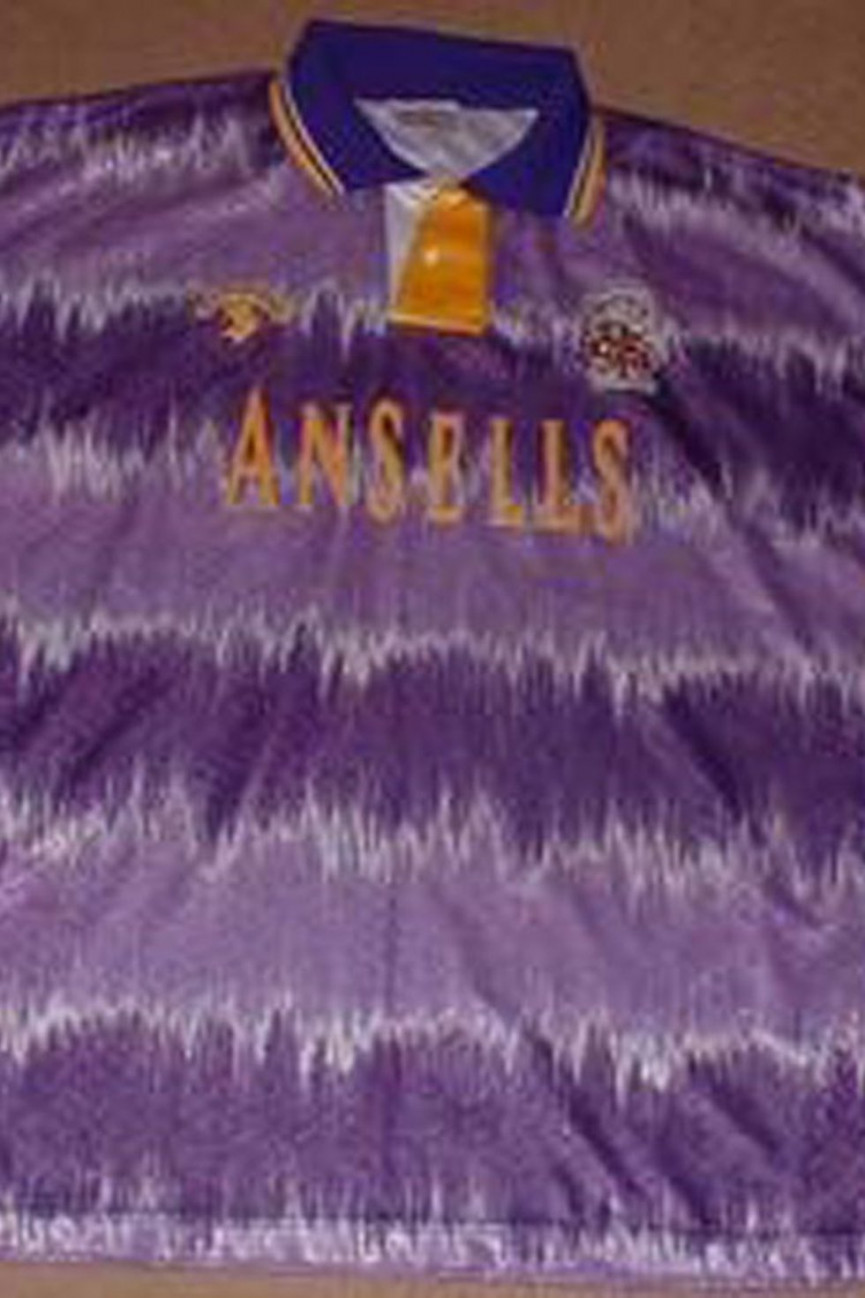
Stoke City
Year: 1993
A purple brother to the Hudderfield monstrosity, this is just horrible.
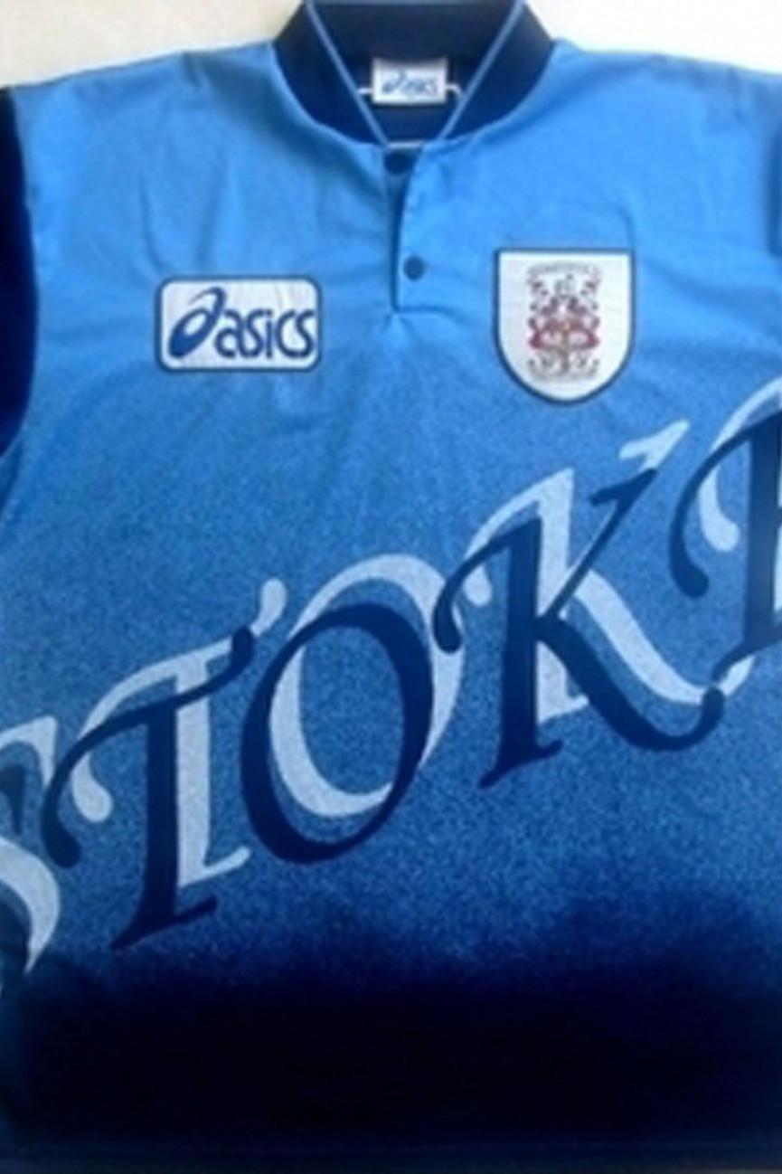
Stoke City
Year: 1997
Someone just learnt how to do Drop Shadow in Photoshop didn't they?
Today's Best Deals

1. Disney+ 7 day free trial
£5.99 p/m after trail

2. Star Wars: The Rise of Skywalker
£14.99 BluRay
![3. Star Wars: The Skywalker Saga Complete Box Set [Blu-ray]](https://cdn.mos.cms.futurecdn.net/KCVCBqcCaBMamDrrgQQg2H.png)
3. Star Wars: The Skywalker Saga Complete Box Set [Blu-ray]
£64.99

4. Nintendo Switch Console - Neon
£279.99
£300.00
5. Sony PS4 500GB Console & FIFA 20 Bundle
£249.99
6. Apple AirPods with Charging Case
£139.00

7. Sony PS4 Official DualShock 4 wireless Controller V2
£49.99
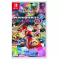
8. Mario Kart 8 Deluxe Nintendo Switch Game
£42.99

9. Amazon Fire TV Stick with Alexa Voice Remote
£39.95
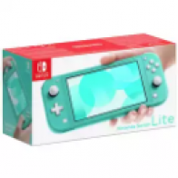
10. Nintendo Switch Lite Handheld Console
£199.99
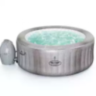
11. Lay-Z-Spa Cancun 2-4 Person Hot Tub - HOME DELIVERY
£320.00
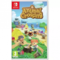
12. Animal Crossing: New Horizons Nintendo Switch Game
£49.99
13. Argos Home 43cm Kettle Charcoal BBQ
£25.00

14. Wahl Colour Pro Styler Hair Clipper 9155-2417X
£12.99
15. Argos Home 4 Burner Gas BBQ with Side Burner
£120.00
After a career in A&R, then as a session musician, Dave took a left turn into writing words. Have edited/written for Shortlist, BBC Three, the i paper, The Times, Vice, Wired and more, Dave enjoys writing about literally anything interesting, specialising in music, entertainment and the environment