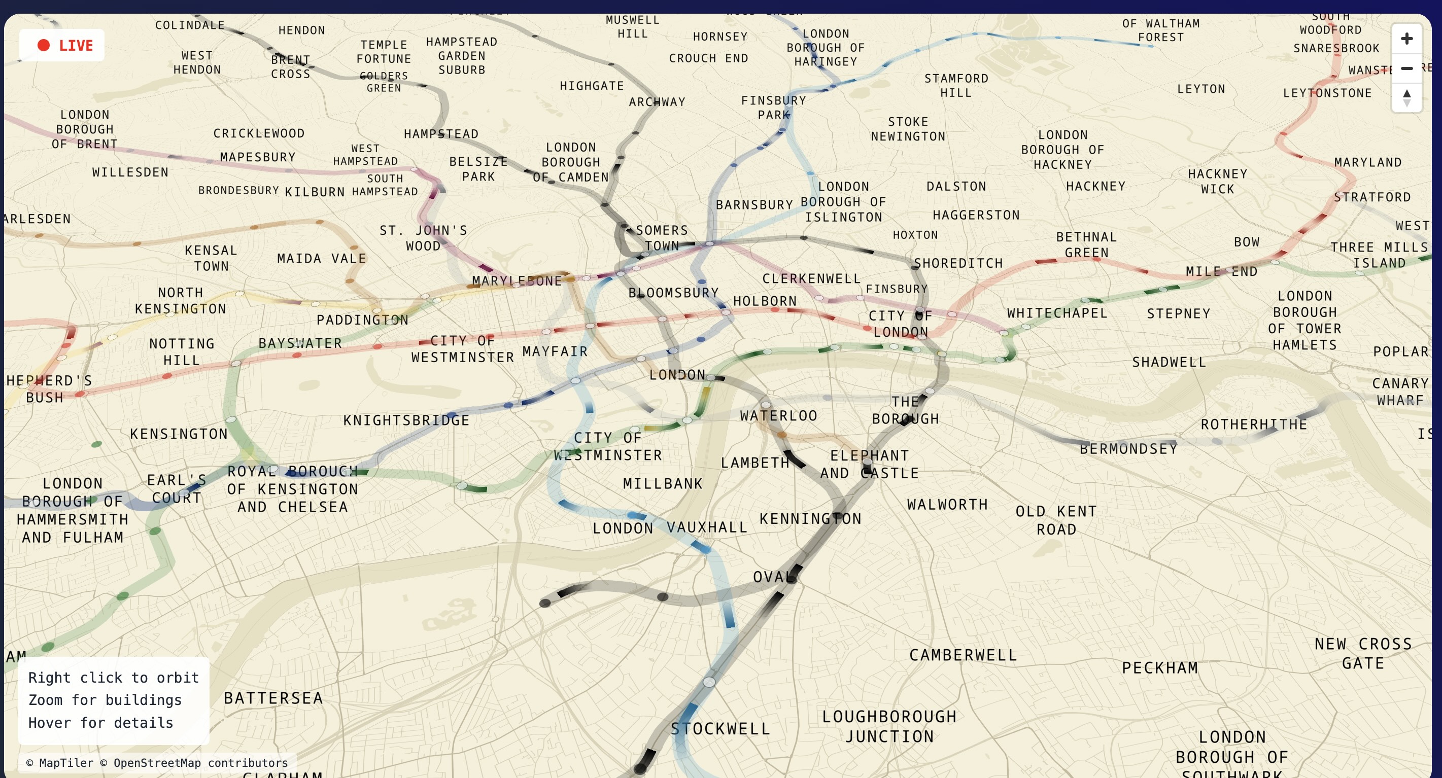
This new interactive tube map will change how you plan your journeys
Citymapper just got competition


Get exclusive shortlists, celebrity interviews and the best deals on the products you care about, straight to your inbox.
You are now subscribed
Your newsletter sign-up was successful
Trying to navigate your way successfully around London sometimes feels akin to being in Jumanji - frantically trying to understand what’s going on, who you are, why you’re here, and crucially, how to get out. So it’s no surprise that Londoners frequently turn to trusty apps from TFL and Citymapper to quite literally help them on their way.
Now, there is a new revolutionary tube map which shows where London Underground trains are in real-time. The animated app is not only a game changer for commutes, but uses live TFL data to show the exact model of each train, its location, and the exact time they’ll get to the station - although, it is London, so take it with a pinch of salt.
The perfect toy for any TFL nerds (pretty much our entire team), and a handy tool for any travel-stressed London locals, the new online map of the London Underground was revealed last week, and shows the exact location of trains at any given time.
The map will look familiar to anyone who's seen or used a tube map before, but it’s much more exciting than any version we’ve had before. When you open up the map, you’ll see the familiar wiggly lines all colour coded to each individual line (black for Northern, light blue for Victoria etc.) and each of the stations is marked with dots. So far, so familiar. On this new map, in between each station, you’ll be able to spot darker lines which represent the individual trains as they move from stop to stop in real time.
What does this mean? Well, basically, you can now track live delays, arrivals, blockages, cancellations et cetera, rather than having to rely on garbled mixed information from various different sources. Plus, it’s fun to play around with - you can zoom in and out around the city, finding your local spots, and travel your way around the big smoke, exploring different routes around some of the world’s most iconic landmarks. Want to see the nearest 3D station to the Houses of Parliament? Well, now you can.
Not only can you see live trains en route, but if you hover over each moving train, you can see even more information about it - including its exact model, its arrival time at its next stops (to the second), and the percentage of the journey it has completed. You know how you sometimes open Instagram to reply to a message and then get distracted with other features for a good five (or more) minutes? Get ready to accidentally do the same for TFL.
The brains behind the map is engineer Ben James who used TFL’s open data to create this new interactive imagining. So, next time you’re stuck waiting for a lift, you can keep yourself entertained with tracking your ride on the map, then call it quits and get an Uber instead.
Get exclusive shortlists, celebrity interviews and the best deals on the products you care about, straight to your inbox.
Main image credit: London Underground Live


Hermione Blandford is the Content Editor for Shortlist’s social media which means you can usually find her scrolling through Instagram and calling it work, or stopping random people in the street and accosting them with a mini mic. She has previously worked in food and drink PR for brands including Johnnie Walker, Tanqueray, Gordon's, The Singleton, Lagavulin and Don Julio which means she is a self confessed expert in spicy margaritas and pints, regularly popping into the pub in the name of research.