It’s long been said by experts that the worst possible font to use on your CV is Comic Sans - but real typeface fanatics know that Wingdings holds that particular crown.
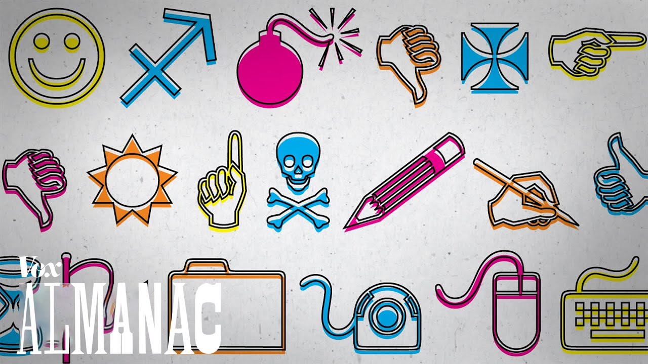
The baffling font, made up of seemingly random imagery - including skull & cross bones and an exploding bomb - has always remained a mystery to the average keyboard clacker.

Its cryptic nature has even made it the subject of a few conspiracy theories, including one widely-shared hoax that it predicted the terrorist attacks of September 11th, 2001 (typing in the fabricated flight number Q33 NY produced an image of a plane hitting two towers. Ahh, email chains).

So to save us from our ignorance, Vox.com have put together a video detailing the history and purpose of Wingdings – and it’s pretty damn interesting.
Wingdings was created to be used as a unique tool for the pre-internet era. It was a bit like emojis, but way more useful.
It used to be much harder to use pictures from the internet. Images were difficult to find and too large to download, and they didn't play nicely next to text. As a solution, Charles Bigelow and Kris Holmes invented Wingdings to create a way to use images quickly and easily, that would harmonise with text.
Originally, the husband and wife team made three separate fonts called Lucida Icons, Lucida Arrows, and Lucida Stars, but they soon combined them all together to build the batsh*t font that we know today.
Get exclusive shortlists, celebrity interviews and the best deals on the products you care about, straight to your inbox.
But there's a bit more to it than that, so have a gander at the video below...


